She comes in colors everywhere
 She combs her hair
She's like a rainbow…
Color is a powerful force that influences us not only
visually, but also mentally, emotionally, and even physically. It’s no secret
that certain colors have an almost universal effect on human beings. Even if you think you don’t know a lot
about the psychology of color, your subconscious does know.
Notice that many nations in
the world use red prominently on their flags. This is because red is considered
a color of power - it looks important- consider the effect of a stop
sign. Put a woman in a red suit,
and she’s “dressed for success”, but put the same woman in a red dress, and the
subliminal messages of
influence and control becomes overtly sexual!
Blue has a calming effect, which
is why it is often used for medical and governmental signage and logos. Yellow
is vibrant and visible, which is probably why it became “the” color for taxis. It’s also used
quite often in children’s toys. Orange and yellow are often use restaurant décor
and fast food chains because these colors used together are known to stimulate
the appetite.
Traditionally, brides wear
white because it symbolizes purity, but during the middle Ages, brides often
wore green because that color was
associated with fertility. And
most of us realize that black frequently connotes mourning.
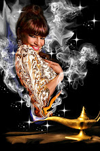
I’ve always been fascinated by color because I’ve painted
and drawn since I was a child- but also because my entire life, I’ve had synesthesia.
Wikpedia describes synesthesia like this:
“Synesthesia from the ancient Greek σύν (syn), "together," and αἴσθησις (aisthēsis), "sensation," is a
neurological condition in which stimulation of one sensory
or cognitive pathway leads to automatic, involuntary experiences in a second
sensory or cognitive pathway.[1][2][3][4] People who report such experiences
are known as synesthetes… In one common form of synesthesia, known as grapheme → color synesthesia or color-graphemic synesthesia, letters or numbers
are perceived as inherently colored.”
Yes… my whole life has been
“colored” by synesthesia.
Case in point: for me, the
number five always had to be red,
three was blue, and the
letter “R” had to be yellow. If I
ever saw one of those old-school magnetic alphabet and numbers sets for kids
and the colors were “wrong”, I would get upset. And usually, when my mother spoke to me, I always saw a
mental image of blue-gray smoke rising from a white cup of coffee. Ok, yeah, I know this sounds a little
far out, but it was normal to me!
However, it wasn’t until I
started dancing that I began to really considering the effects of color- not just on myself but on my audience.
Pre-dancing, I wore primarily black or blue, and it was
always a toss-up as to which of those colors I would pick as my favorite. As a rock and roll chick, those colors
were easy to wear- think denim and leather. Red probably came in a close third, but more as an accent
color rather than something I would think of wearing head-to-toe. There were also certain colors I would avoid
completely- such as brown, green, orange, yellow, gray or pink… but I wear all of them now often, both onstage and
offstage.
 |
| Photo By Lapis |
Curiously, people always seem to associate me –or more often,
my "royal" dance persona-with the color pink. True, the background of this blog is pink and the main page of my website has a hot pink background- but both of those graphics happened after I was already being associated with that color. I also have a lot of pink
things- clothing and accessories. But I wasn’t sure why
I was being connected with that color in particular; especially cause through
the ages, purple has typically represented royalty- hello… Prince, anyone? In my entire dance career, I’ve owned maybe three pink costumes-one of them is pictured here- and it made me really ponder
about why my image or persona was so heavily connected with pink.
Then it hit me- it was because of the “Princess” part of
Princess Farhana! Pink is a
color that is linked with femininity. When faced with the color pink, most
people think of romance,
glamour, little girls, breast cancer awareness and of course, fairy princesses.
Then I realized that most of the pink things I own- cell phone cases, coffee
mugs, hip scarves, jewelry, t-shirts, pot holders, flasks, iPad covers…you name
it…have all been given to me!
When
people hear the word “princess” they associate it with the color pink.
So…what do your costume
colors say about you? Do they go with the intention you had
in mind for your performance? Are you picking out these specific colors because
they make you feel good, or because of what you want to convey to your
audience?
Here’s a list of just some colors in alphabetical order- and what they
subliminally represent to the general public. I’ve also included what their unique
properties-or hazards- may be on
stage, or when worn by performers with different types of coloring:
AQUA
This soft, fresh-looking mixture of blues and greens has most of the properties
of true blue- it sends out calming and serene vibrations. Onstage, aqua
costumes might remind the
audience of youth, springtime, or even mermaids, among many other things. Aqua is a terrific color in
performance because it flatters so many skin tones, from very fair to extremely
dark. On a large stage with full lighting this color may appear white unless
the lighting looks natural.
BLACK
In real life, black is an imposing color that signifies
authority. As we all know, black is often worn for funerals, but it also
implies elegance and timelessness. Onstage it can represent a variety of
things, from poverty to evil…which is why this color is so popular among Goths!
Black absorbs light and can wash out a fair-skinned performer; it usually takes
someone with very strong features and high coloring to carry it off.
If the background of the performance area is black, a black
costume can cause the performer’s skin (which is always lighter than the costume, no matter what your race
is!) to produce an unpleasant optical illusion. The black costume pieces will
appear to recede and the performer’s lighter skin will appear to jump forward,
causing the performer to look oddly heavy. This effect is doubled if the
performer has dark hair, which will also recede into the background. In order to avoid this, make sure your black costume ( and dark hair, if that's what you have) are decorated with a contrast color or colors, or are very sparkly. Either of these will add texture and dimension to the black, and cancel out the effects listed above.
BLUE
The color blue actually causes the body to produce chemicals
that promote a feeling of serenity and tranquility, that’s why it is so often
used to paint bedrooms and hospital rooms. The phrase “true blue” is right on because blue also
symbolizes loyalty. Blue is also supposed to increase productivity.
Onstage, a nice, bright
medium-to-royal blue colored costume will retain its color accurately under
almost any sort of lighting...and also looks very nice on a wide range of skin and hair colors.
BROWN
Abundant in nature,
brown symbolizes the earth as well as sincerity and dependability. It is considered a “friendly” color.
Brown costuming onstage can appear muddy and sallow, especially if it has
yellow or gray undertones, however, a rich warm brown with a red or orange
undertone can look beautiful.
GOLD
Of course gold symbolizes richness, wealth, and a touch of
the precious or exotic. This
beautiful warm metallic will look terrific in performance, retain it’s true
tone under any manner-or lack-of lighting, and is universally flattering.
GRAY
 |
| Photo by Celeste Hines |
The color of ashes, storm clouds and lead, gray can be a
somber tone, signifying dignity modesty and intelligence. The equal mixture of
black and white, some people consider gray dull and colorless, but gray is also
an elegant hue that is often worn by the elite- think military uniforms,
fencing suits and tuxedos at the Kentucky Derby. Depending on the shade of gray
being worn by a performer, it can signify many things. This color can have many undertones,
even appearing to be a light purple on stage, depending on the scenery, back
drop or lighting. A dove gray
costume trimmed in silver can be gorgeous on a pale brunette, or cool and
removed on a blonde. It doesn’t look too great on redheads, and it can make
deep olive to African American skin tones look ashy and sickly.
GREEN
Green is another calming color, probably because it
symbolizes nature; it’s the color of plants, grass and trees. For these reasons, green, like blue,
has a calming effect and is often used in interior decoration. Green symbolizes
luck, youth, hope, peace and prosperity…ever wonder why dressing rooms are
often called “green rooms”? Now
you know! It also has the
subliminal projection of money…
and whenever I have worn a green belly dance costume, I’ve gotten a lot
of tips! This color in
it’s many shades looks lush on redheads, whether for street wear or the
stage. if you have olive skin or are very tanned, you can rock a neon lime green costume like nobody's business! When performing in shades of green,
avoid green or yellow stage lights, as they will both wash out the true tones.
LAVENDER
A romantic and calming color,
lavender is a mixture of soft blues, reds and whites. Depending on whether it
has more blue or red, undertones, lavender can look very cool or extremely
warm. Onstage, lavender lighting when mixed with pink and amber looks soft and yummy. This color is considered
feminine and inviting without being seductive. Lavender in it’s many varieties
looks very beautiful on a huge range of performers.
ORANGE
Stimulating and energizing,
red is a warm color that appears “friendly”. This color can be hard to pull off
for pale dancers because it is so intense and can overpower dancers. If you are
very light-skinned, try a subtle peach tone instead of a true, citrus
orange. However, orange, coral or
metallic copper look fabulous on
those with darker skin and hair, providing a warm glow that looks healthy and
glamorous.
PINK
As I said before, pink is associated with femininity and
youth… but it doesn’t have to be a frou-frou color! Pink comes in so many shades from pale ballet slipper pink to
hot magenta, there is literally a tone for everyone… it can
look great no matter what your hair or skin tone is. It’s a vital, fresh color
that looks happy and fun onstage.
If hot, bright lights illuminate your light pink costume, it may fade to
appear white. Whether wearing extremely pale or stronger tones of pink, make sure your stage make up
is sufficient so that you
don’t appear washed out or over-powered.
PURPLE
Equal mixtures of red and blue, this secondary color is
considered dreamy, elusive, mysterious, and rich. Signifying royalty, purple is the deeper cousin to lavender,
and also can look great on a variety of dancers, depending on its undertones.
Elizabeth Taylor favored purple clothing and costumes in many shades because it
brought out her lavender eyes. A
nice deep purple costume, especially of satin, velvet or metallic lycra has the
same properties as blue in performance- it looks wonderful on almost anyone,
under many different lighting washes.
RED
You already know that red stands for power and authority, but
this strong and passionate color- the color of blood and fire- also signifies
speed and prestige…which is why fire engines are red and also why so many men buy red sports cars in the
midst of their mid-life crisis! A
true bright red can be hard to pull off for blonde performers, but looks
dazzling on brunettes and those with darker skin. Red with blue undertones will make everything from teeth to
skin look whiter, so compensate for this by using strong make up with a lot of
blush. Red with yellow undertones can make olive skinned performers appear sallow.
SILVER
Silver is a rich metallic color that has many of the
properties of gray, but with a touch of playfulness. Just like gold it
symbolizes richness, but is often associated with a sleek modern feel. Onstage, silver appears much cooler
than gold. Silver costumes will
flatter paler skin tones, but might make those with olive to dark skin look
ashy unless the make up is intense and warm.
 |
| Photo by Pixie Vision |
TEAL AND TURQUOISE
These cousins of blue are considered jewel tones, and share
many of the properties of aqua. True, deep turquoise, even though it’s
technically a cool tone, is a also a hot tropical color that will look fantastic on
anyone with a tan, real or fake-bake. Slightly deeper and with green
undertones, teal will be a little more difficult for lighter-skinned performers
to pull off but looks fabulous on brunettes and red heads.
YELLOW
Cheerful, exciting and hopeful, yellow is the color of
daffodils and many other flowers. The color practically screams, “notice me”,
which is why it is used so often on taxis and emergency vehicles. Because it
keeps the viewer on alert, it is also a popular color for writing paper. Yellow
comes in so many shades that you’d be hard-pressed not to find a shade to
flatter your skin tone.
Yellow can sometimes be overwhelming to wear, but those with darker
skins will look great in “hot”
yellows that have a little red or orange in their base- like the meat of a
mango. Pale lemon yellow looks great on fair skin, and compliments many shades
of hair or eyes. Make sure to check your yellow costume out under stage lights
and adjust your make up and contrasting accessories so that you do not appear
sallow or sickly.
WHITE
White is the color of brides and the good guy hero. It
signifies purity and innocence, and reminds the viewer of summer time. Clean,
modern-looking and efficient white can also connote cleanliness and sterility-
think lab coats and nurse’s uniforms. In performance and in day to day wear, this radiant color reflects
light, and can look pretty and crisp on almost anyone. Remember that a white costume
will take on the colors of your stage lighting, so plan accordingly.
** Read the entire Wikipedia
article on synesthesia here:
http://en.wikipedia.org/wiki/Synesthesia


I almost always wear green, because I look good in it (freckled red head, you know!), sometimes teal or aqua, too. Or black.
ReplyDeleteI choose which shade of green I'm going to wear based on the emotion of the piece and the style I'm going for. Fun and happy? I'll wear bright jewel tones like emerald and teal. If I'm going for a watery mermaid look, teal, and aqua with some green accents. Vintage-inspired or faerie-themed, I go for olive and brown. And then if I'm doing something Gothy, I go for black and silver.
I told myself I'd buy something other than green at Tribal Fest, but there was so much nice green I couldn't buy anything else except one black choli!
HA HA!!!!!!!!! That's like when you go to buy a new cute lil' black dress, then you go home and open the closet and it's full of them!!! : )
DeleteGreat article Princess! I love this topic and I think it is very interesting how you have percieved color thruout your life. I bet that made many things frustrating for you. Though today it seems you have a very healthy and creative relationship with color, not to mention a great sense of style ;)
ReplyDeleteFor me purple, pink, and peacock blue have always toped my list. However, I find in performance I like white a lot. It makes me look more tan and it glows under blacklight...which is lots of fun.
~Adonia
www.VintageBellyDance.com
yes!!!! I love white too!!!!! I was afraid at first to get white costumes, cause my white clothes always got stained the instant I put them on... magically, that NEVER happened to the white costumes!!!!
DeleteI LOVE YOUR BLOG!!!! Just sayin'! : )
Our customers LOVES, turquoise, red, dark purple, and fuschia. All depends on their moods, depends on what they wanted to wear and purchase, usually, teens love vibrant colors, and our bellydancers does not like to wear bellydance costumes in white.
ReplyDeleteIf you're looking for a solid contextual advertising company, I recommend you take a look at Chitika.
ReplyDelete